Wednesday, 30 September 2015

After discovering how expensive it is to have slides made up from digital files I have printed the contact lens photos on acetates to test out the format of using the carousel slide projector without having to spend a lot. It looks as if the quality might not be the best with the images having to be so small - I can see the pixels with my naked eye so it will probably be very obvious once enlarged on the projector. 


I love the associations that are made when this is held against the sky... a planet in space, or a moon in the clouds? A friend also has said that it reminds her of a cell, which I really like and hadn't thought of before. Cells make me think of identity, and as we discussed in my Death Cafe, a contact lens is an identity object, very personal to the person. How curious, that one image can be both a planet and a single cell. 

Saturday, 19 September 2015

Lionel

I was asked to make a papier mache ape for this year's End of the Road Festival. I have made paper heads for the festival before as well as for school plays, but I was yet to make anything on a larger scale. It took me about two weeks to make and reminded me how much I enjoy using my hands and physically making things, an aspect of my art practice that has reduced since I started working from a more conceptual perspective. 


I found it a little challenging to work to someone else's brief without having much contact with them - I was communicating over email and didn't really want to ask too many small questions. It was tricky to decide what approach to take with the colourings and style of the ape - whether to make it very realistic or more vibrant and cartoonish, which I knew would suit the festival. I decided just to go with my instinct and use the colours I thought looked best. 


As I was repeatedly studying reference images of chimpanzees and carefully sculpting the facial features with paper, I began to observe the similarities/differences between peoples' faces and chimps'. In the same way that drawing makes you more observant and aware of small details, I started to look at people's faces with this increased analysis, thinking about the contours of the brow bone or the shape of the nostrils - imagining how it would need to be sculpted and arranged, what colours I would mix together to find the right skin tone. Sometimes when I'm bored, usually on a train, I decide to look at things in this way - ignoring what I know, what I've grown up being taught about the colours of objects, and consider what hues I am really seeing (e.g. yellow leaves, brown trees, white skies). Making the monkey, this started to happen involuntarily. 


Nb. My mum called him Lionel, I resisted but it stuck.

End of the Road Leaves


Ed and I very willingly volunteered to cut lyrics into leaves for the second year at End of the Road Festival in Dorset. When we arrived, we discovered that the tree/bush we had used last year had been completely cut back so had to relocate. There were several factors we had to consider in choosing a new location - how many people would be passing through the area and whether it would be noticed; whether it was a 'pretty' area that would suit the poetic lyrics; we also had to discuss our choice with the festival decor crew to determine whether it would fit with the other installations they had planned. It was decided that we could us ethe fairy light trail this year, which we were pleased with as it is a really beautiful area, the leaves could be seen at night as well as during the day and it is a popular pathway for people to use. It is tricky to describe the experience of the fairy light trail at night, but it is a pretty ethereal and awe-inspiring place... (the first year we worked at the art department we were tasked with putting out the fairy light so I am all too aware of how many sets of lights are used).


We went and stood in the clearing where he had cut the leaves at various points throughout the weekend - it is so enjoyable to watch people discover and experience the leaves. We also witnessed people taking photos of them, with them and even sneakily stealing them (which we don't mind). I decided to pick up some of the dead leaves from the floor and cut 'End of the Road 2015' as momentos for the keen eyed - I just love people coming across them, almost as a perk of being observant. I dropped them surrepticiously arounfd the place and then sat and watched people find them... or completely miss them. One very little boy picked one up and showed it to his dad; the dad photographed it and then hung it back on tree. I thought that was really touching. 


The response on social media was even greater than last year because of the more popular location. It's been facinating to see the ;eaves appear on twitter and instagram, and to read the comments. Ed also discovered that Sufjan Stevens (headliner and all round incredible person) had posted a photo of a leaf with one of his lyrics that I had cut) - achievement of the year! How wonderful for it to get back to the artist who wrote those words.

Wednesday, 16 September 2015

Venice Biennale - Vitrines and Display

On my visit to Venice I kept a particular eye out for the way in which works were displayed as this is becoming increasingly important to my work. With such a vast amount of artworks it was an ideal place to carry out some research on this and to get some ideas. I observed a huge range of inventive ways of exhibiting works.


I particularly liked this way of displaying sheets of paper (above right) in a very long display cabinet that stretched across the room. Elongating it made it into more of an architectural piece, and drew you long from image to image; to me it was just a really elegant piece of design as well. In the dark space the underlit works were also made inviting and mysterious. 


Again, I was drawn to this long, elongated vitrine used by Shilpa Gupta, it shows that its very effective to use a display case that follows the shape of the work - something to bare in mind.


This image above I just found quite curious; they had managed to illuminate the picture in an oval shape, which I just thought was quite unusual. A I don't really make images all that much I never consider how they might be displayed in interesting ways, but lighting is clearly a really key device. I like how it acts as a frame in the darkness.

Venice Biennale - Words and Images

I went round the exhibitions at Venice with my dissertation topic of titles in mind, and was really interested by what I discovered about the different ways in which image and text are used in artworks. I tried to make a fe wnoted on each , which I will run through...
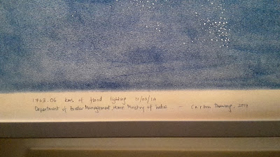
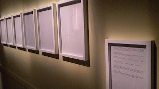
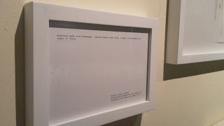


Shilpa Gupta used text a lot and in different ways - it was very much a part of the work, instead of just a supplement or caption. This is evident in how the text has been framed as if pictures themselves; I thought the frame was a curious tool, almost like a title in itself, saying that the words were the work, and elevating it with traditional gallery protocol. In the first image here, Guptaalso just captioned her image in pencil below in a much more informal way - I wondered what this gave the work that would be missing if it were written instead on a caption or label separate to the image. It is almost as if the work is part of a journal this way - it has been noted and dated in the moment, it belongs to that specific time with that handwriting. Printed text would be more of an afterthought, more premeditated. 
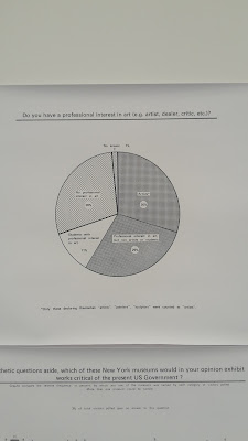

Hans Haacke made these works of statistics and charts, combining text and imagery in a familiar way. There was a whole wall of this information, with a very large amount of text. Clearly, in this instance text is very much the work. I wanted to remember this and recognise that text exists in different contexts, not just as title or caption, or words within a painting, but as a function within everyday activities and processes. Therefore works using things like books, or found objects with text on or works such as this, where writing is a part of an established system,  include text in a less emphatic manner; it is almost a constituent part of a bigger thing. 


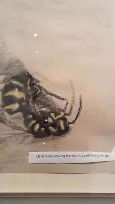
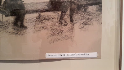
Olga Chernysheva's drawing caught my eye because of their odd-looking tacked-on captions. Although not a fan of the intentionally informal presentation of the text, I really relate to the tone and intrinsic relationship to the images. It is clear that they are very much reliant on each other - to say that her work is the drawing would be wrong, because the captions play such an important part in framing what the viewer sees in them. I absolutely love the sense of humor and irony in them, especially the wasp drawing. They remind me of the way I try to caption my Instagram posts; often I post pictures of really mundane things like mold but try to explain why I find it interesting - the same for my work i some instances, I always feel I need to tell people what it is that I want them to see. I'm considering mentioning these works in my dissertation as I think they're such a fascinating example of text and image being dependent on each other to comprise meaning.