A collaboration with Ed came about with these thoughts in mind. He has being "exploring the application of synthetic processes and digital mediation applied to a commodified colour theory" (quote from him). One of his experiments has been averaging the colour of sections of the floor in his studio, finding the closest match in Dulux emulsion paint, and pouring the paint onto clear perspex.....
On visits with him to B&Q to get paint I started to think about how darkness is conveyed in the form of emulsion paint. I have had a fascination with the perception of colour depending on light and context for a while now - my Blue Marlble project documenting the blue of my student home every morning was an investigation into how one colour is actually very many different ones (something to do with phenomenology would be written here if I had a better understanding of it - I'm working on it). The book I read over the Summer by Simon Ings on vision also described how colour is percieved differently by societies - how a colour can be established and acknowledged in some cultures and not recognised at all in others. Well... it was very interesting to see how different paint companies acknowledged their darkest shade. The range and peculiarity of the names given to the paints was very intriguing and ties in rather well with my dissertation investigations into titling.

On visits with him to B&Q to get paint I started to think about how darkness is conveyed in the form of emulsion paint. I have had a fascination with the perception of colour depending on light and context for a while now - my Blue Marlble project documenting the blue of my student home every morning was an investigation into how one colour is actually very many different ones (something to do with phenomenology would be written here if I had a better understanding of it - I'm working on it). The book I read over the Summer by Simon Ings on vision also described how colour is percieved differently by societies - how a colour can be established and acknowledged in some cultures and not recognised at all in others. Well... it was very interesting to see how different paint companies acknowledged their darkest shade. The range and peculiarity of the names given to the paints was very intriguing and ties in rather well with my dissertation investigations into titling.
Ed and I decided to collect tester pots from different companies and present them together with their names,,, the idea being that really, they would all look very alike, highlighting how the text attempts to alter or suggest something about the colour. The commodification of darkness is also a curious concept.
I feel I must acknowledge my interchangeable use of darkness and black - there is certainly something about the word darkness that evokes a more poetic image than the word black; perhaps in its vagueness and the richness of its connotative potential. It seems very important that the work be titled as samples of darkness, and not as black because black is arguably less subjective. Black is perhaps the least subjective colour even (most colors can be argued over, is it turquoise, is it blue, is it navy? The number of different whites supplied by paint companies is astonishing, but black...is black.) Darkness is also mysterious...the words are even given as synonyms. The images that come to mind are of shadows, of dusk, of space, of uncertainty, always just out of reach of our understanding. In a similar way to how the paint companies attempt to harness colours into commodities with titles, naming darkness seems absurd because it is an attempt to make familiar the unknown and tie down the elusive. The paints we found were named as follows:
Supernova
Pitch Black
Soot Print
Highland Darkest Tarn
Charcoal
Jack Black
Sinner
Rich Black
Black Dress
Pitch Black
Soot Print
Highland Darkest Tarn
Charcoal
Jack Black
Sinner
Rich Black
Black Dress
Black Magic
Foret Noire
Foret Noire
Railings
Bond Street
Black Fossil
Bond Street
Black Fossil
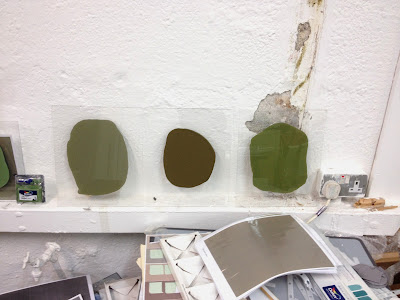
To keep the amount of paint consistent we used a teaspoon to place the paint on the perspex (and rather like the title Teaspoons of Darkness, mixing something difficult to define with an everyday object). A teaspoon of darkness in the corner...

As the tester pots for some companies cost up to £5 + postage, we made a decision that for our initial workings we would only purchase and use three paints and name them as if they were the real thing. Surprisingly, in my crit and tutorial no one questioned whether they were the paints that they claimed to be. This in itself raises lots of interesting questions - Does this reduce the impact of the work? Honestly, I don't think so, they all look very similar anyway. Does it reduce the integrity of the work? In my mind yes - if we were to exhibit it anywhere other than the studio I wouldn't feel comfortable with the deceit (even though I have fibbed with other works such as the library slip I presented at the Schism show). Perhaps because this involves brands and companies and copyrights, or perhaps because I think if it were displayed in a more formal setting people might notice that there is only a variation of three colours. Also, the work would of course be a lie - what it intends to say or imply or convey would be wrong, would be absent ...or would the lie actually say more about not knowing and how darkness links with blindness, and how seeing links with knowing?


As the tester pots for some companies cost up to £5 + postage, we made a decision that for our initial workings we would only purchase and use three paints and name them as if they were the real thing. Surprisingly, in my crit and tutorial no one questioned whether they were the paints that they claimed to be. This in itself raises lots of interesting questions - Does this reduce the impact of the work? Honestly, I don't think so, they all look very similar anyway. Does it reduce the integrity of the work? In my mind yes - if we were to exhibit it anywhere other than the studio I wouldn't feel comfortable with the deceit (even though I have fibbed with other works such as the library slip I presented at the Schism show). Perhaps because this involves brands and companies and copyrights, or perhaps because I think if it were displayed in a more formal setting people might notice that there is only a variation of three colours. Also, the work would of course be a lie - what it intends to say or imply or convey would be wrong, would be absent ...or would the lie actually say more about not knowing and how darkness links with blindness, and how seeing links with knowing?
At the moment the work looks like this...


I have been trying to think of more formal ways that it could be presented. I kind of wish we were given more information on this sort of thing at uni - how to display a drawing, how to hang a painting, how to attach a TV to a wall etc. - I'd find that really useful. Ed suggested looking at this work by Philomene Pirecki as it is presented at Frieze in New York, glass on a metal frame, which would be quite simple to make...


No comments:
Post a Comment